Turn boring widgets into click magnets. Learn how to make Forsere’s social proof pop with emojis, smart placement, and personalized variables like name and country no coding needed.
Let’s be honest. We’ve all seen social proof widgets that just... blend into the background. They’re technically there, but they don’t make us pause. They don’t make us feel anything. They definitely don’t make us click.
And that’s the problem.
At Forsere, we believe your widget shouldn’t just display information. It should pull the visitor in, spark their curiosity, and create a tiny moment of interaction that changes everything.
Passive Widgets Are a Missed Opportunity
Think about it: your website visitor is juggling tabs, checking Slack, and probably sipping coffee while scrolling. A static widget with plain text like:
"John just signed up."
...is not going to cut it.
But a widget that’s alive? A widget that feels like it’s reacting to them?
Now you’ve got something.
Add Emotion with Design
Let’s start with visuals. Even one emoji can change the emotional impact of your message. Consider these two:
"John just signed up."
"🎉 John just joined Forsere — welcome aboard!"
The second one feels human. Friendly. Like something you’d see in a chat, not an alert. And that emotional shift makes people more likely to trust and engage.
Don’t stop at emojis. Use:
- Subtle animations (fade-in, slide-up)
- Clean icons (like checkmarks or clocks)
- Color variations that match your brand
Forsere supports all of it, and it’s ridiculously easy to set up.
Positioning Changes Everything
Where your widget appears matters. Some people are used to seeing alerts in the bottom right. Others naturally look to the top.
Try different positions. Bottom left might work great for mobile. Top right could grab more attention on desktop.
And here’s the real win: Forsere lets you test this without needing code edits. Just toggle and go.
Use Language That Invites Action
Make your copy feel like a nudge, not a notification. Phrases like:
- "See what others are saying"
- "Catch the trend before it ends"
- "Real signups in real time"
...encourage people to click and explore.
When paired with good design and smart placement, these phrases do more than inform. They invite.
Also, with Forsere’s variable support, you can personalize the message even further using data like:
- First name
- Country or city
- Product name or plan selected
For example:
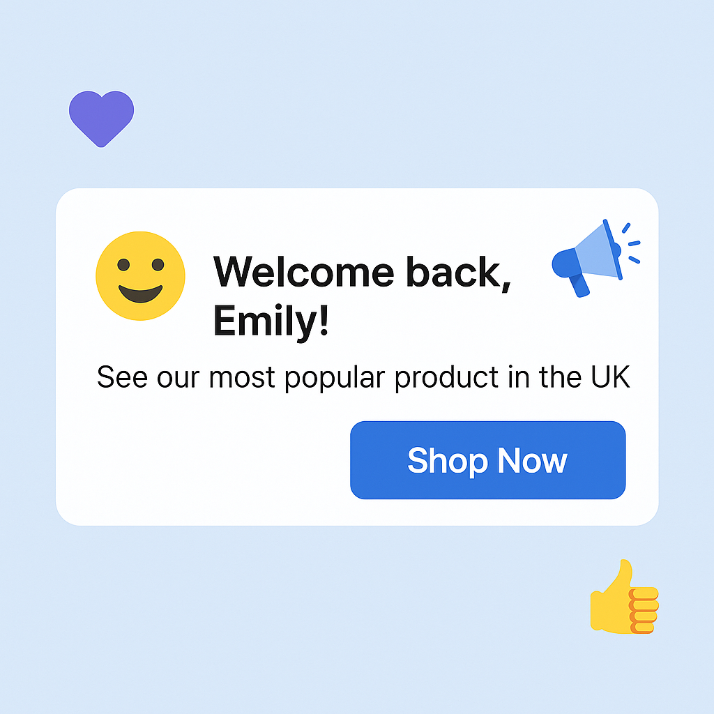
"🎉 Emma from Paris just grabbed the Premium Plan!"
Personalization adds credibility and makes the widget feel alive.
Bonus Tip: Match Interaction with Intent
If a user is on your pricing page, use interactive messages like:
"🎯 Just now: SaaS founder from Munich chose the Pro Plan."
If they’re on your homepage:
"🚀 You’re not alone. Over 100 visitors are exploring Forsere right now."
Context matters. Matching message tone to the visitor’s intent amplifies the effect.
In Summary
Widgets are not just visual noise. They’re tools of persuasion.
With the right mix of animation, emoji, placement, variables, and message tone, your Forsere widget becomes an active part of your sales funnel.
So ask yourself: Is your widget something people glance at, or something they feel?
Make it interactive. Make it human. Make it matter.
Because even one more click can be the start of something big. 🚀